A RETAIL STORE [pacsun]
 The retail store pacsun obviously has a lot of different items to display which allows for various lighting. Throughout the store, there are several rows of track lighting. This works well because of the variety of objects to be displayed. There are also special lighting fixtures [filament lighting]=>see picture below. These fixtures allow the space to be more personalized and comfortable. The fixtures create a textural element to the space and also reflect a certain mood because of the fixtures characteristics. When you walk into the space, one of the 1st things you notice is an illuminated shelve that displays products. I think it works very well and is very appropriate. Above the check out area there are rectangular suspended light fixtures. I really like this fixture because it shows the importance of the area without using signage. The light is a yellow shade and directs the customers eye. Overall, I think that this space is extremely successful. I think the lighting techniques for display work well and do not take away from the product. Some fixtures create visual interest but still fit in with the theme and mood of pacsun. However, most of the light is contained within more effective if they incorperated lighting between shelving. All in all I feel this space is very effective and successful.
----------------------------
A RESTAURANT: [shane's bbq shack]

For the restaurant, we went to Shane's bbq shack. The resaurant is not expensive and appeals to pretty much everybody. There are several forms of lighting. Overhead, in the ceiling are fairly small LEDs which don't produce that much light. On the walls, above the booth seating are strands of lights that look like christmas tree lights from the 70s. These lights add character to the space refering back to the idea of a shack. These lights don't really serve a purpose except for visual interest. The lights reflect the colors onto the wall, but not to the extent of being tacky. They add character to the space.

Shane's bbq shack contains both booth seating and table seating. Above each booth are suspended filament lighting fixtures. They are extremely bright and very hot. The light reflections define each individual space. Working in the restaurant business for over six years, i realize that these fixtures are extremely annoying. When serving, you always seem to hit your head on them. When eating, the lights are too bright and shine in your eyes. They're also very hot. I extremely dislike these fixtures. The booths are extremely overlit and overhead the tables there is no lighting and seems dark.

Where you place your order, there is track lighting directed onto the menu. As seen from the picture, this creates a lot of glare. I think different fixtures or lamps could be a lot more successful. From the picture, you can also tell that the sign is really the only thing lit up. Overall, I think that some of the lighting techniques are successful and others are not.
------------------------------------
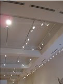
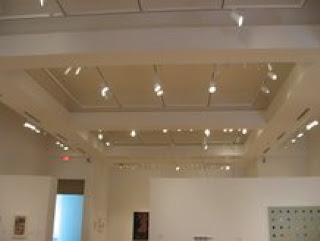
A MUSEUM: [weatherspoon art]
For a museum, we decided to take yet another visit to weatherspoon art museum. For art museums, i feel it is important to have direct lighting that does not compete with the actual art. I thik the weatherspoon art museum has a very balanced lighting system. They have high ceilings and directed track lighting. The lights are not overwhelming and do not take away from the art and sculptures. The lighting is more condensed along the main walls. In the hallways, they have allowed for natural lighting which really illuminates the space. The space overall is very plain which works for it's specific purpose. Because of the ceiling height, the lights are at a further distance from the art which makes the diameter of the reflected light to be larger. If the lights were closer it would make the light seem like a harsh spot light. Overall, I feel that the lighting techniques in this space are very successful. The lighting adds to the space but does not take away from the art which is it's intended subject of focus. The lighting is soft and allows you to focus.

The stunning design of the mall! I love these ideas. Thank you for sharing this. I have many ideas of the great. Flos Arco
ReplyDelete