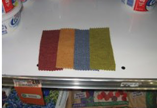
RETAIL STORE:
[tabletop]

[display case]

For the retail store, the top picture was taken on a table shelve. I noticed the stronger light was directed on the end of the table where most things would be displayed. Since the color is a dark color the lighter fabrics show more contrast. The second photo was also taken within a display space. The light was a lot stronger which allowed for me to see a lot more texture from the samples. You can also see more shadow which adds to texture too.
--------------------------------------------
RESIDENCE
[wood table]

[carpet]

For the residence, the swatches on the wood grain show more texture. Maybe this is because of the contrast of material. Against the carpet, there really isn't anything exciting, hardly any shadows and the lighting makes the fabrics almost smooth.
---------------------------------------------
LIBRARY
[table]
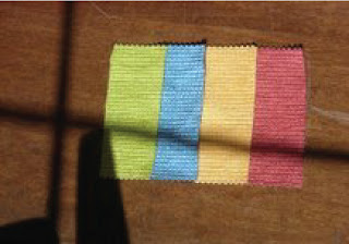
For the library, there was a lot of natural light. This photo was taken at a table close to a window. The outside light seemed to enhance the colors of the material swatches. You could still have a sense of the materials texture. The overcasting shadows were a bit annoying and if you stayed to read for a long time the shadows and light quality changed, making it a bit distracting.
-----------------------------------------
STORE
[shelve]
For the grocery store I went to Bestway, which isn't the most well lit place. There were fourescent lights along the aisles. With the material swatches, you couldn't really identify that they had a texture. The lack of light made the colors very dark.

This article has got me thinking...I know a glass blower and I'm gonna contact him to show him these products, they're so cool! Flos Arco
ReplyDelete